I wrote last time about how much I love the Salmagundi Club, and in particular their current exhibition, All About Winter. What I didn’t mention was that I prepared a piece of artwork for the exhibit but it wasn’t accepted. It seems many of the artists were equally inspired by the theme and prepared works explicitly for this exhibit, as much of the artwork on display is dated 2022.
I was disappointed, but not crushed, that my artwork was not accepted this time. It was my first attempt at painting in acrylics, and I really didn’t expect I would make the cut. After viewing the work that was included in the exhibit, I came to understand that perhaps my amateurish technique wasn’t the issue (though maybe it was). Another factor was that the art in the exhibit is strictly representational. Whereas my piece veered into the abstract.
The Challenge
When I received the Salmagundi Club’s Call for Entries for the All About Winter exhibit, I was really excited about the theme. I went through winter photos I’ve taken for the past few years, but there was nothing I wanted to enter. I wanted to do something different, and the challenge got me thinking.
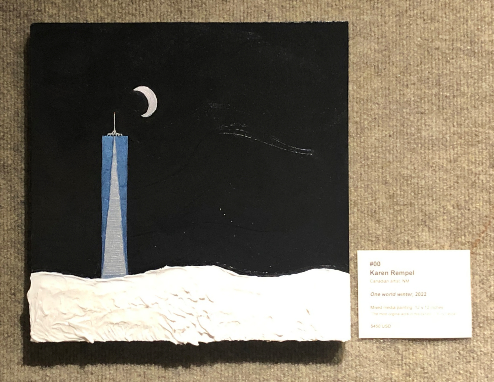
In October, when my belle soeur Mimi was visiting, I had seen a striking view of the One World building from West Twelfth Street as we crossed Seventh Avenue. The night sky was blackest black, the building glowed blue, and a brilliant cresent moon nestled close. This image had remained vividly in my brain, and I wanted to capture my vision somehow.
Planning a Vision
I was also excited about the idea of creating snow, with a texture like creamy icing and the sparkles the snow casts back to the sun. I spoke to my sister Kim about my ideas, because she’s an amazing painter. She thought acrylics could work well, and advised me on how to tint the white for the moon with a bit of yellow or red. She also advised me to add some blue to the sky’s black so it wouldn’t look dead.
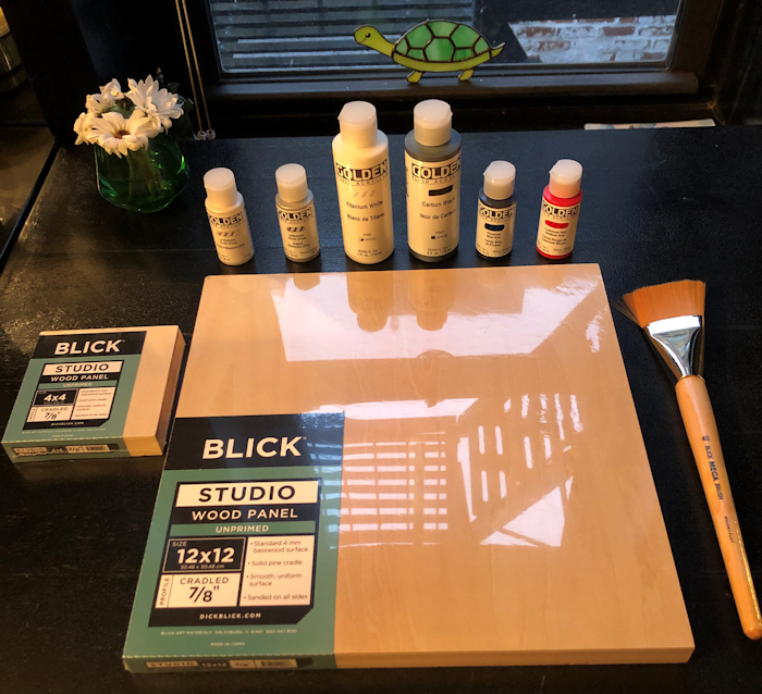
I had a Sunday, November 13, to execute the painting in time for the deadline. I was in quarantine from a recent Covid test, so I went online and found that Blick would be able to deliver the supplies I needed on the Thursday before my scheduled painting day. (This is how someone with a full-time technical writing job schedules her precious few hours for creative pursuits.) To my delight, I found iridescent pearl and iridescent silver—glorious additions to the colors Kim had recommended.
Painting Day
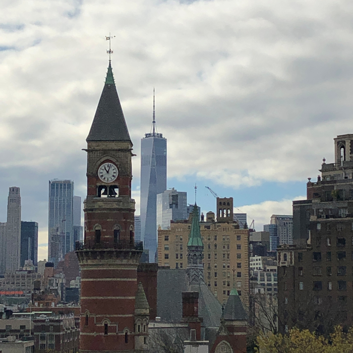
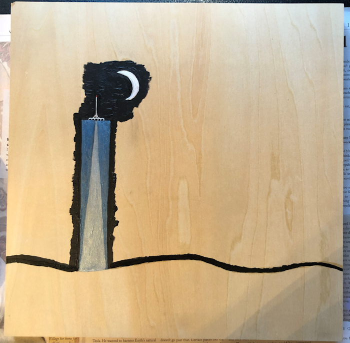
On the Sunday in question, I crept up the fire escape outside my kitchen window to the rooftop of my building, where I took a photo of One World to use as a starting point for my drawing. I printed the photo, and then traced the outline of the building with tracing paper.
Next, I drew in the curving snow line and the fingernail crescent moon. The moon was a bit problematic, and I had to tinker quite a bit to get the shape, eventually using a quarter to get the curves right. I also added the constellation of Orion, which I had seen completely (astonishingly) from the rooftop during the full moon eclipse on November 8. But eventually I decided not to clutter the painting with that detail.
However, that intention impacted the spatial dynamics of the drawing. In the final painting, I think the moon is uncomfortably close to the building, even though this was how it was in my vision.
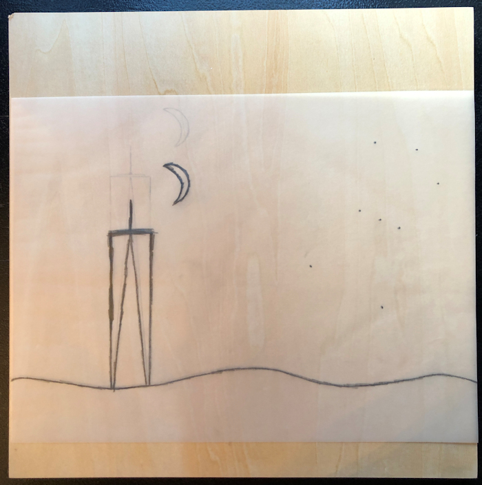
I traced the image on the wood (creating a reverse image first, as I learned to do earlier this year in Anna Mason’s pear tutorial). But the original placement of the snow line didn’t look right. I retraced the image again, with the snow line a bit lower, extending the height of the building. Now it was right—a feeling in my belly that told me that I could relax.
With the outline in place, it was time to take the plunge and break out the acrylics!
This was my first acrylic painting, so I wasn’t sure what to do. But I’d learned a bit about mixing color from the Anna Mason tutorial, so I mixed Prussian Blue with the Iridescent Silver to obtain a glass-blue for the building, with the silver in the central angle. I followed Kim’s advice regarding the moon, and added a bit of red to the white to create the initial shape. However, I ended up using the iridescent pearl and a Uni-ball Signo broad silver gel pen to get the shape right, and the moon wound up being mostly silver in the end.
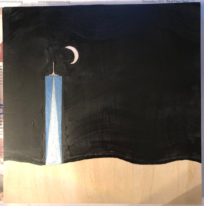
The next part was really fun. Being completely untrained, I feel free to use any media I like when I create. So I pulled out my black nail polish and traced the curving lines of the snow in Revlon! As Kim advised, I mixed the Prussian Blue in with the black paint. I used a small #2 brush to trace around the building and moon. I was worried about the small brushstrokes, as I wanted to create a broad sweeping effect like a Van Gogh sky. I brought out the honking big Mega Flat brush I’d purchased from Blick. I started as close to the building and moon as I could, and made sweeping, swirling strokes across the sky.
However, as you can see above, there were bumpy ridges from the initial outline. Also, the grain of the wood panel was showing through. I had anticipated that the dark colors would cover the grain nicely, but not so. (Lesson learned: always prime with gesso first.) Since I was attempting to complete the painting in a day, I hadn’t wanted to take the time to prime and wait for it to dry. The bumps and wood grain were bugging me, but I decided to proceed while I figured out what to do.
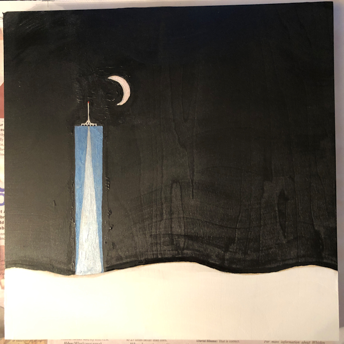
I decided I should prime the snow area with white paint. I also thought this might make my ultimate medium stick better…
After I finished the white paint, I tried sanding the bumps with fine sandpaper, but it didn’t seem to work. Continuing along with the nail polish theme, I took out a manicure sanding sponge and sanded away the ridges of paint. Success! Then I did a second coat of swirling strokes with the black.
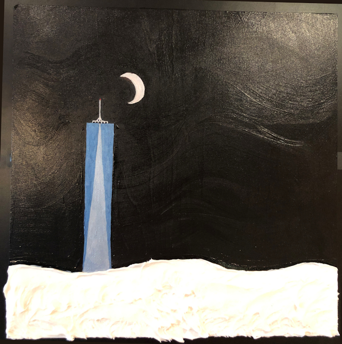
Finally, it was time to add my secret magic ingredient! I had been thinking about this for weeks, and had purchased three types of white frosting from my bodega, H&H on 6th Avenue: Betty Crocker, Duncan Hines, and Pillsbury. I opened all three, and did some samples on my small test board. Without question, Pillsbury’s Creamy Supreme provided the best color and texture.
I slathered it on, creating artistic snowy ridges. For the finishing touch, I sprinkled the snow with iridescent and white sparkles from Michael’s. Finally, my vision was a reality! This is such a good feeling.
Rejection
The next challenge I faced was to photograph the painting for submission. Previously, I’ve always submitted digital photographs, which are easy to prepare and submit exactly as I want them to be seen by the adjucidation committee.
It’s much more difficult to use an iPhone to get a true square representation of a hung piece of art. (My friend Constantine later told me that the way to do it is to use a telephoto lens from across the room.) Another issue is the lighting, and getting the brushstroke details to be displayed the way I want. The third issue is that my camera could not capture the sparkle in the snow, no matter how much I shifted the phone quickly and tried to catch the gleams. In the end I submitted the photo above.
Rejected!
A New Idea
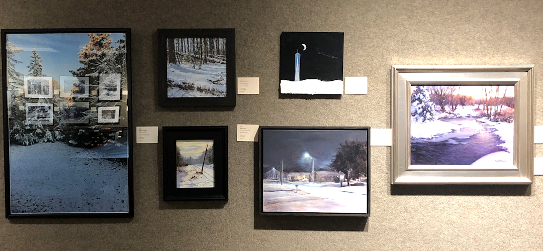
Still, I didn’t feel too badly about it, and I went to the opening of the exhibition, as I described in the previous post. I savored the many expressions of snowy winter scenes, and enjoyed several French 75 cocktails, expertly prepared by the Salmagundi bartender, Gray. That was when I noticed that the artwork that had been accepted was alike in one respect: all the pieces were strictly representational. And mostly rectangular. And all framed. So there was a look the committee was going for.
But I also noticed there was a bare nail on the wall. Hmmmm…
I also noticed the unusual paper that the club’s manager, Brandon, had used for the exhibit labels. I complimented him about it, and asked him what paper he used. He was kind enough to give me a sample of the paper, and a bit of paper from the packaging that gave the details. Neenah exact index ivory paper, 90 lb, smooth, acid free! Owing to my tipsiness from the French 75 cocktails, I lost the papers, but Brandon very kindly gave me another sheet and another bit of packaging. Coincidentally, when I met Eric Ringsby a little later in the evening, he gave me his web address on a torn half of an exhibit label.
All the tools for a deception were in my chilly hands…
Anarchy at the Salma
I may have had an inkling of an idea before I went to the reception, but certainly all the pieces fell into my hands that evening, and beckoned me to commit an audacious act.
The next day, Saturday, December 24, I took my artwork down from the bedroom wall, where I’ve been enjoying it every night as I go to sleep. I retrieved the sheet of ill-gotten ivory paper. I brought out my manual layout ruler. I measured font sizes and space between bits of text. I composed a saucy but heartfelt review by the recently deceased art critic for the New Yorker, Peter Schjeldahl:
“The most original work in this exhibit” – P. Schjeldahl
I like to think he would have thought so.
I created a label for my painting that imitated the others in the exhibit, albeit slightly altered to include this lovely quote.
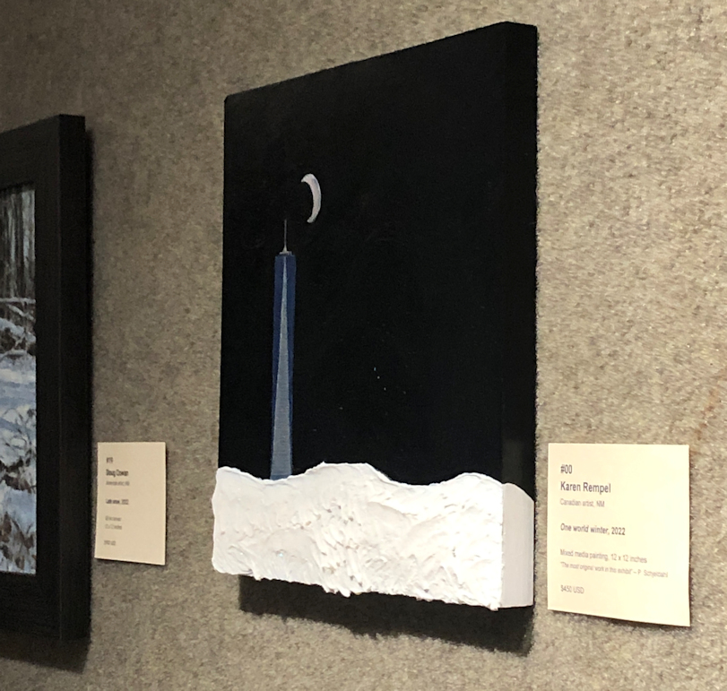
I hadn’t painted the sides of the wood panel when I originally prepared my work for submission, so I brought out the paints again and coated the sides, bottom, and top. I also wasn’t 100% satisfied with the One World building, as it seemed the paint wasn’t thick enough and some of the ground peeped through the sheen of color.
So I mixed up the Prussian Blue and Iridescent Silver again, scrutinized some quickly Googled photos of One World, and then added another layer of paint with horizontal strokes to create the impression of the windows for the dozens of floors in the building. I also filled in a tiny bite out of the moon that was on the top curve, using my silver gel pen.
I carefully wrapped the still-damp painting with newspaper and masking tape, and slid it into a small tote bag. I put the label in an envelope, and tucked the envelope in a large handbag together with duct tape, scissors, a hammer, and four nails. I was trying to anticipate everything I might need. The exhibit’s labels were actually fastened to the gallery’s fabric wall using velcro, but I checked and my CVS didn’t have any on hand. So a classic Canadian MacGyver solution was called for: silver duct tape! The hammer and nails were in case the available exposed nail was no longer available.
I arrived at the Salmagundi Club about an hour before closing, 4 PM. I greeted the manager, Brandon, who’d given me the ivory paper the night before. We chatted a bit about the freezing cold weather, and how to spell his last name (Beckstrom), and then I asked if I could view the exhibit again. He accompanied me downstairs and I asked if the bar was open. It wasn’t, but he very kindly gave me a glass of wine, on the house. I really like this guy!
Then he left me to view the exhibit. The space was deserted, though I think Brandon was in the dining room on the lower floor, so I didn’t want to make any suspicious noises.
I went directly to the spot where the empty nail was the night before. Still empty! I quickly slipped the newspaper off the painting, and hung it on the nail. Mission half accomplished! I was worried about the sound the crumply newspaper had made though. What if Brandon heard it and came in to investigate?
So I walked to the far corner of the room and coughed several times as I unpeeled and cut a piece of duct tape and fastened it to the back of the label. I began whistling “Patience” by Guns N ‘Roses to cover the sound of my placing the label on the wall. Success!!
My work was now on the wall, with its subversive art review and its completely original composition of acrylic paint, nail polish, gel pen, frosting, and sparkles.
I spent another 20 minutes admiring the other art in the exhibit while I drank the glass of pinot grigio that Brandon had given me. Then I chuckled all the way home.
I love the skullduggery! Your tenacity is what legends are made of. Looks like fate provided you a way to “nail” down an opportunity to expose your artistic talents. May the future bring broad strokes of creativity, sweeping lines of inspiration and dabs of imagination.
Brilliant Bruce, I appreciate your way with words!
Quite the impressive subterfuge Karen. Maybe you were an art thief in another life. Definitely a unique assortment of mixed media used in your piece. Congratulations on getting your art exhibited ?
Thanks, Kim! 😉 I amuse myself, anyway! Perhaps my art will finally get a red dot! haha
Wow. You are fearless. What happens if nobody official notices the arrival of your work—at least not until the work comes down off the wall?
There’s going to have to be a follow-up post to this one, eh?
You’ve hit the nail on the head! haha
There’s a plan afoot to cat burgle the artwork. 😉